St. Mark’s Community Church
Some big changes are coming to the facilities at St. Mark’s. This capital campaign articulates what facilities and aspects of the church property need updates, how these improvements will enable the to congregation to better use the space, and how outreach to the community will be enhanced. The branding contains the icon from the church brand and outward-facing arrows, conveying how this campaign serves to serve not merely the church’s comfort but the church’s ability to serve.
Capital Campaign Branding
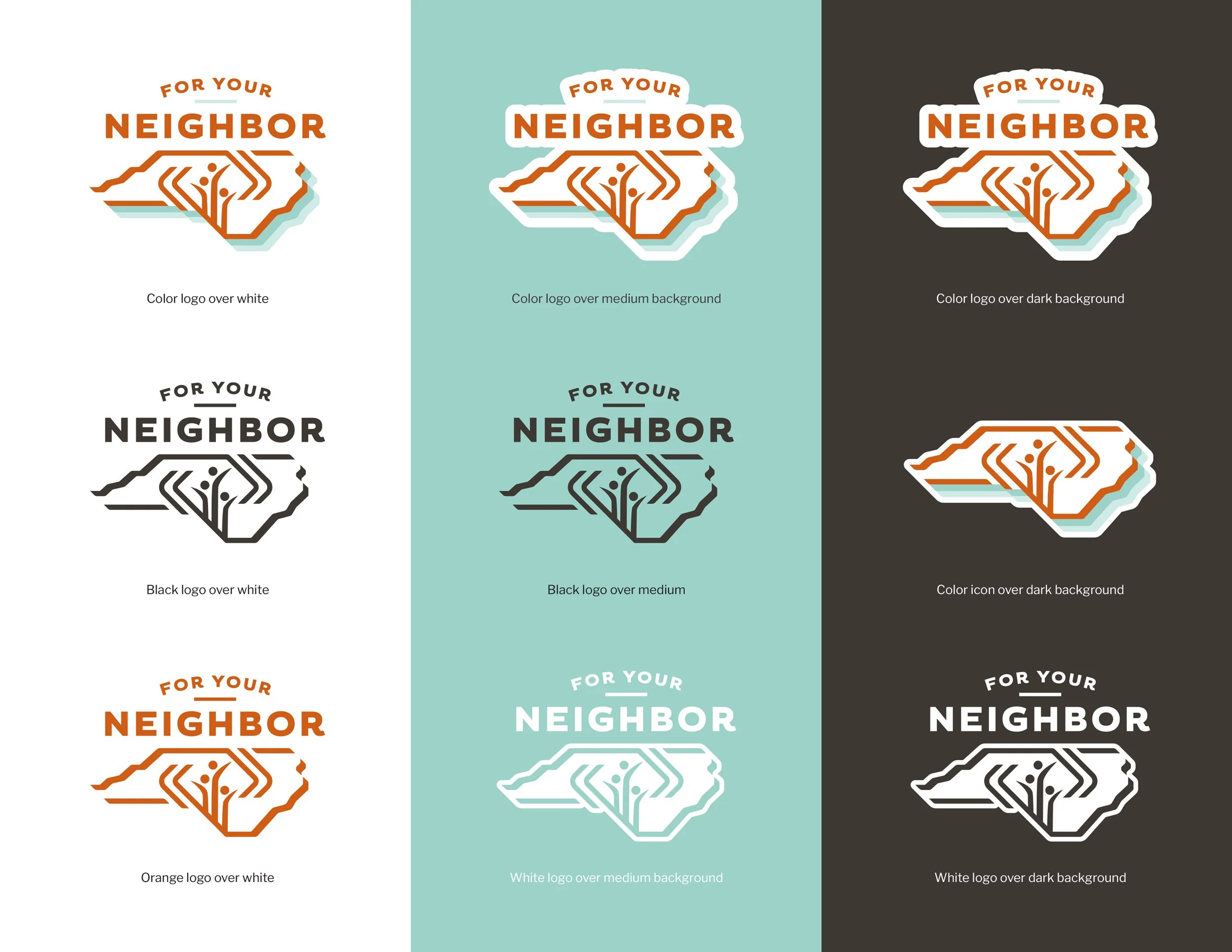
Logo Color Versions
We create different color versions on every brand project so that the brand will function properly in full color and one-color environments. This is an example of how the different logo versions organized and applied over white, a medium, and a dark background.